Monday, 11 April 2011
My Pitch.
Pitch
Introduction- we are group four and we have decided to design and promote a piece of hand luggage based on parameters of air travel.
Product Development section …
Board 1 – This is the product that we came up with, Midnight by Chanel Classics is the new piece of hand luggage made by Chanel in conjunction with Samsonite to be used as a travel bag.
Board 2- Our user is an executive fashion design manager shown here in the customer profile board. She craves design that is both fashionable and yet fully functional. The bag can be carried in several different ways. It can be pulled by unbuckling one side of the long shoulder strap and pulling the bag behind you on the fold out wheels. This is useful if the bag is really heavy. This would be very easy on the smooth floors that most airports have. The bag can also just be carried like a normal handbag, over the shoulder in the crease of the elbow or simply in the users hand.
Board 3- Here is an exploded view of the outside components of the bag. This view also shows and exploded view of the wheels and where they will be attached to the bag.
Board 4- This shows the pockets on the outside of the bag one on the front and one on the back. The front pocket of the bag is covered by a large flap and secured by a magnetic button. The back pocket is secured with a large long zip. these pockets are easy to access quickly for things such as passports, tickets and mobile phones.
Board 5- This shows and exploded view of the inside components and pockets. At the back is the large zip pocket, then on the inside there are three small pockets that can be used to carry small objects like loose change, keys and a pen. Then there are two large pockets that can separate the users main items such as clothes, shoes, accessories and business items. There is then a laptop case for protection of the users laptop and other valuable items. Then lastly there is the front pocket, This pocket contains the detachable clear plastic bag 20 x 20 for liquids when travelling by plane.
Board 6- How the wheels work. The wheels work with a simple mechanism exactly like the adjustment mechanism in a pair of crutches. When the wheel has been pushed out a small pin is positioned in whole number one to secure the wheels from collapsing under the weight of the bag. When the wheel needs to pushed back into its case the user just needs to press the pin in and move the wheel upwards until it clicks into the second whole and is secured.
Board 7- Materials, the bottom corner of the bag is reinforced with high density polystyrene to protect the bag and to also give it some rigidity. This plastic is then covered over with printed leather in the style of Chanel. Polyurethane material is then used for the main outside parts as it is cheaper than leather and also lighter. Gold plated copper will be used on all the metal parts instead of solid gold to save on cost. Glass diamonds will also be used instead of real diamonds to save on the cost of the bag.
If the product sells well different colour can be introduced into the range.
Fashion brand boards by Rachel
Thanks for listening any questions…
Laura
Pitch. Inspiration and promotion
As discussed we have decided to separate the pitch into sections: intro, inspiration/colour scheme, product development and finally promotion.
I will talk about inspiration/colour scheme and promotion.
Inspiration
We looked at what customer we would want our product to appeal to, we decided it would lean more towards the higher end of the market so would be suitable for acorn groups AB. (customer profile board) When we decided on hand luggage and our customer we looked into possible brands. We liked the Samsonite collaborations with Victor and Rolf and Alexander McQueen so thought it would be a good idea to do something similar. We chose Chanel as it is a premium brand and has a very elegant style. Since we want our product to have longevity in terms of wear and style we focused on the Chanel classics range. This inspired our colour palette. We kept with the basics, main part of the bag to be blacks and greys and the detail in gold.
Promotion
The main theme in our promotion is to keep it all black and white like the usual Chanel style. From researched we discovered alot of Chanel promotional campaigns have a model that is the face of the product, we decided to go along with this idea and have the same model on all promotional items. The face of Midnight.
For point of sale we have made 2 parts, a window display and the instore promotion. The window display is a simple design with the campaign image as the main focus with the midnight bag infront. Designs of window displays will differ from store to store depending on size. Instore for the launch of the product, at the accessory section the top 2 shelves will hold 2 midnight bags and the promotional image behind them, this makes the bags at eye view when the customer enters the store.
The swing tag follows the same theme, a white bow holding the two parts together, keeping with the Chanel style. Since its a collaboration we decided to have a little book inside attached to one of the compartments explaining the collaboration.
The keyring idea came from Paul Boutique. Although this would be more classy. Its a subtle form of promotion based on the style of Chanel jewellery. It can be used anywhere. The padlock and key are to be used as an aspect of security for the hand luggage itself.
Rachel
Sunday, 10 April 2011
Swing tag ideas !
Swing Tags ..
These are some ideas I designed for a potential swing tag ..
The second one is the one we liked ...
This swing tag ties in with the rest of the promotion, with the joint logo, campaign image and continues with the black and white promotional theme. The finer details are slightly different to our other campaigns – changing the chains and charms to a simple, white bow. Also a trademark of Chanel. Simple, yet effective design with use of a transparent vintage wallpaper for the top of the swing tag allowing our image to be seen through.
Dani x
Saturday, 9 April 2011
Development
Final?
I went on to illustrator and gave the window a ledge to make it more realistic, i added gradient to each of the panels and placed the bag on it to make it look like there is a gap between the window and the promotion image. I put a gradient over the whole thing to make it look like its glass.
Rachel
Rachel
New window display?
I found this window display and thought it was quite a cute way to advertise, the image could be billboard or even a window display with the bags in front of the background. The image with the writing and the bag in the corner could be used as many different forms of promotion, it being found in magazines, billboards and in store.
Rachel
Rachel
Point of sale
Friday, 8 April 2011
Promotional ideas .. poster !
Chanel inspired advertisement
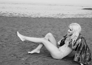
Here is the original image i used of our model. Using Photoshop I removed the model from the background and dragged her onto a new background, one which would fit Chanel's usual style.
Here is the original image i used of our model. Using Photoshop I removed the model from the background and dragged her onto a new background, one which would fit Chanel's usual style.
Here is the completed image. I think it represents Chanel's sleek and classy style well. Although we'll need to work on our campaign logo combining both Chanel and Samsonite.
Danielle x
Tuesday, 5 April 2011
presentation board 1
This is the first presentation board. Any others that are made must be in the same style as this so our presentation flows between our two aspects. This will make our presentation look good and gain us more marks as a group =) If you have any questions about how to do anything on the board just ask me and I should be able to help! Hope it looks ok =)
Laura
Laura
Friday, 1 April 2011
Making off..
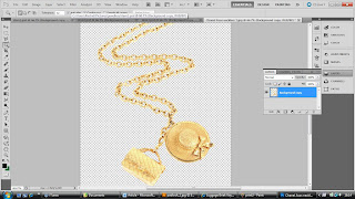
This is the development of the making of the keyring, still needs to be edited, but its the basics to show how its looking.
Rachel
Rachel
 |
| The first few printscreen are just showing how I cut the image out on photoshop |
 |
| Inputted all my items into illustrator, cropping them down to fit better on the keyring |
 |
| Keyring with all the aspects attached |
 |
| I rubbed out parts of the rings to make it look like they are actually attached |
Keyring Promotion
These are the images i will use to construct the keyring promotion, i will take certain aspects and combine them together. Rachel
Subscribe to:
Posts (Atom)


